I have always been drawn to the creativity exuded through macabre imagery. So when the MIA announced last year that they would be getting the "Guillermo del Toro: At Home with Monsters" exhibit I marked my calendars months in advance. I was able to get tickets to the preview party the night before the exhibit was to open to the public.
The event quickly sold out.
As you walked in the threshold blinked at you as if you were stepping right into the mouth of a monster. The crowd was instantly greeted by the exhibit's guardian. Ominous and evil yet so intriguing everyone couldn't wait to see what else awaited beyond the entryway.
The eyes actually blinked. It was very unsettling and fascinating all at the same time.
The sculpture is larger than life and set the stage for what was to come.
There were original works from some of my favorite artists like Edward Gorey. But also there were many artists I was introduced to that I had never heard of like Rick Geary.
Sketches by Edward Gorey. I love his style and sense of humor.
I discovered the artist Rick Geary. I just love his work!
There was stunning original artwork made for del Toro's films. I was particularly drawn to the concept art. I love seeing the beginning of ideas before they have been molded into the final product. There was even some original concept art for Disney! I geeked-out over it!
Poster by Drew Struzman for "Pan's Labyrinth."
Concept art for "Pan's Labyrinth" by Raul Monge.
Kay Nielsen "Fantasia" concept art.
Original Marc Davis concept art used in development of the Haunted Mansion attaction.
We also got to glimpse inside of the mind of the man himself and see original sketches, storyboards, and concept art he created. There were stations that displayed his notebooks with digital versions that allowed fans to page through the images in the book.
I was truly impressed by his level of talent and detail in his drawings.
Fans use the digital screen to flip through the sketchbook.
Of course the exhibit housed the wonderfully weird side of art. But I was surprised by the sheer size of some of the life-sized displays and the quantity of high-caliber work on display.
Portrait by Travis Louie.
There was a substantial amount of work by Richard Corben.
This gigantic Frankenstein bust has become a signature piece of the collection.
Frankenstein and his bride.
So creepy and life-sized.
There was also a large quantity of items in the exhibit that were real-life oddities. I particularly was drawn to the vintage photographs of circus freaks.
This display was a stunning collection on its own.
There was also items in the exhibit that were of stunning classic beauty. The esthetic of the items had a real broad range.
Gorgeous screen used gowns.
A classic subject oil painting by Benjamin West.
Layouts for glass windows.
The best part of the night was getting to 'people watch' and see all the fans engage with the show. This exhibit was a cross between fine art and pop culture that brought out fans across all genres.
This image alone showcases how diverse the artwork was.
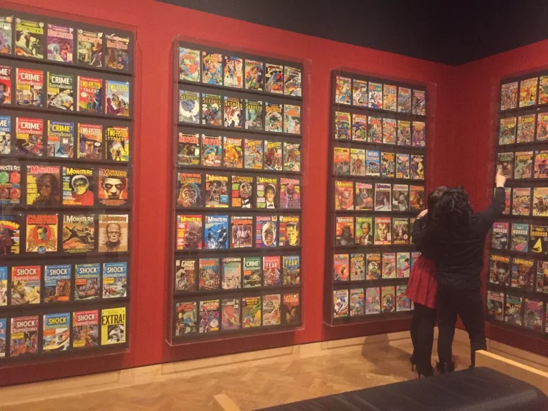
His collection of pulp magazines proves mainstream can be fine art.
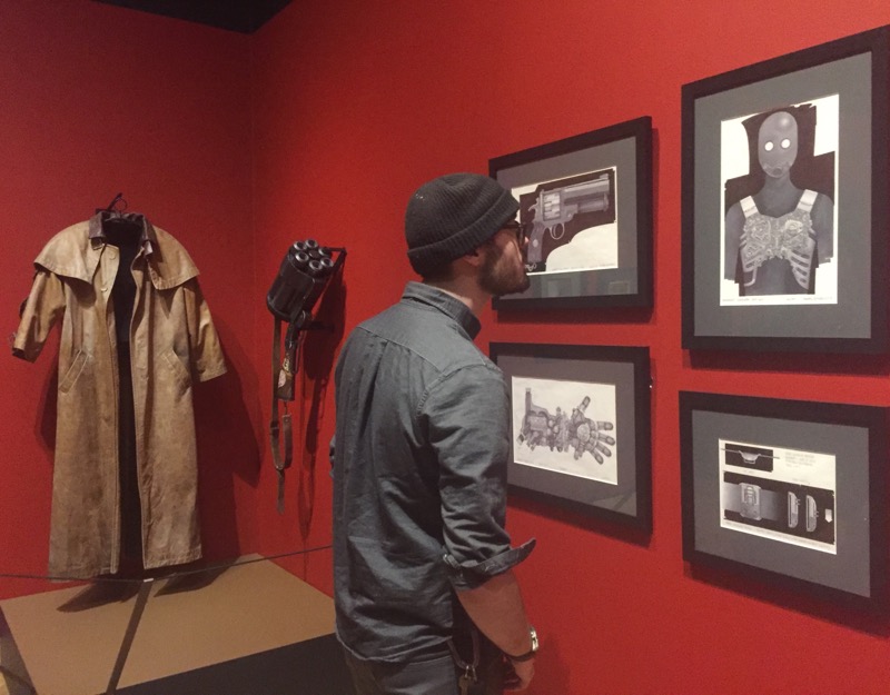
A fan checks out "Hellboy" concept art.
This exhibit has high engagement. Bringing what you see on screen right to your fingertips.
The feeling of being dwarfed by this nightmare puts you in the silver screen.
There was also a high level of fan participation with dressing up in Gothic styles or as their favorite characters.
Best selfie of the night.
This was a fan costume... NOT a display!
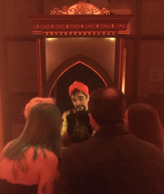
Outside of the exhibit the event wing was turned into a darkly themed evening with entertainment, drinks, hors d'oeuvres, and even a magic genie granting wishes!
The theming fit perfectly withe the exhibit.
He granted my wish!
The exhibit will be on display in Minneapolis through May 28, 2017. Be sure to check this one out! It has something for everyone!
Oh and did I mention there is a super awesome Snapchat filter for the exhibit?
Perfect!


